We went through so many cover designs: the lone tomato vine snaking around the title, the tomato vine peeking through the picket fence. Bright sky, dark sky. Flaky paint on vertical fence slats, flaky paint on horizontal fence slats. It’s a tricky business, landing on the right design. It has to do so many things in an instant. Most importantly, it needs to capture the attention of the right kind of reader. But who is the right reader for Broken Homes & Gardens? I pictured a twenty-something girl with black-rimmed eyes, sitting in a Portland coffee shop drinking Americanos. Her hair would be tangled. She would be wearing all black and listening to The Cure. She would be frowning. Maybe crying.
“Huh,” said the team over at Blank Slate Press. “We were picturing a twenty-something woman as well, but our twenty-something woman would not be wearing that much eyeliner.”
“Interesting,” I said.
“And she wouldn’t be drinking that many Americanos. Or if she was, she’d take them with cream and sugar.”
“Tell me more.”
“She probably wouldn’t be listening to The Cure.”
“I like to think of twenty-somethings listening to The Cure.”
“Okay, she can be listening to The Cure. And her hair can be tangled, but she wouldn’t be crying.”
“Fine,” I said.
And so, after this completely fictional conversation, I began to imagine a different kind of reader, a reader who enjoys off-beat love stories about kind of messed up but mostly endearing characters. She wants a book that is entertaining and also kind of moody and heart-wrenching. But mostly entertaining. She’s going to be walking through Powell’s or browsing through her Kindle and see the perfect book for her. It won’t have a tomato vine or a picket fence. It will look like this:
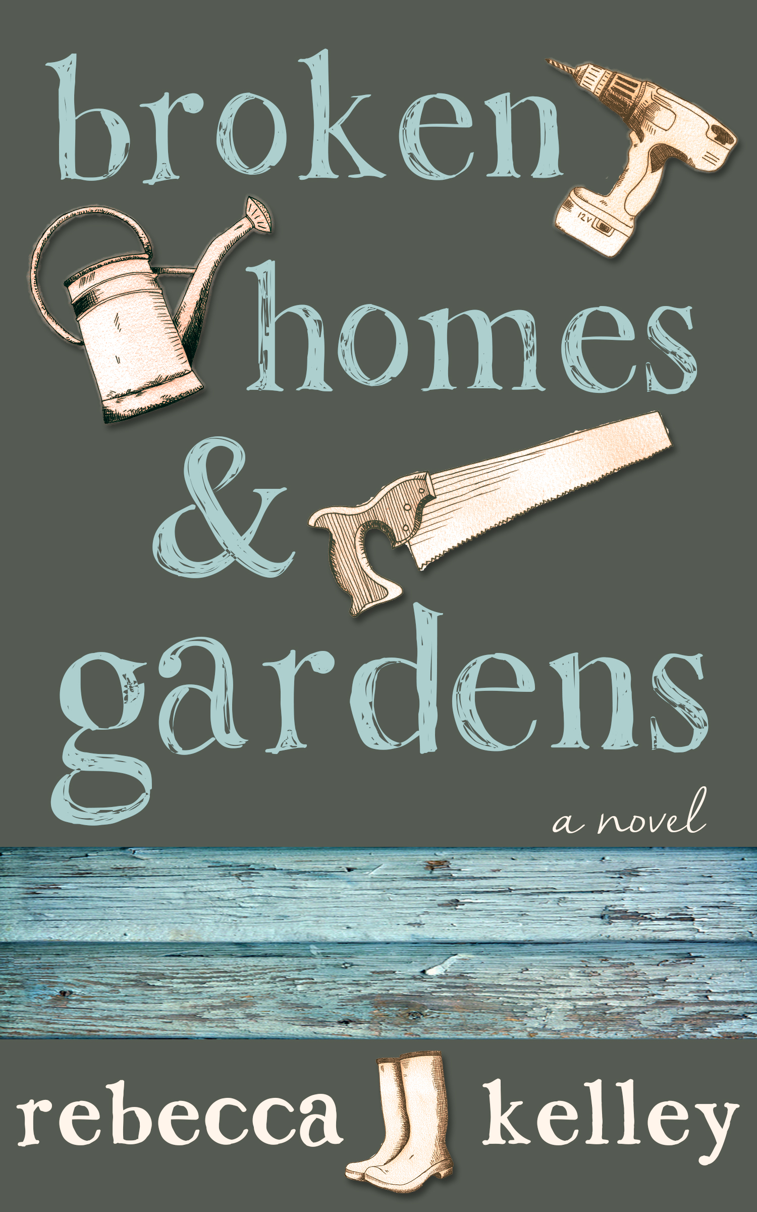
She’ll gravitate toward it. She’ll take it to the coffee shop and start reading it in line. She’ll order her coffee, an Americano. “Room for cream?” the barista will ask.
“Yes.”
END SCENE

Leave a comment